MFA Exhibition Next Week

IMG_2415

My graduate thesis work will be completed in the next week and the conclusion of that work is a public gallery show at Purdue University. The show titled Community as Client is open to the public from Monday 11/11 through Friday 11/15.On Friday November 15 at 11:30am I will be giving a public talk about the work and the last years worth of research on social design that developed into the Well Baby Toolkit, my MFA thesis project. The Well Baby Toolkit will be released to public at the Gallery opening on Monday 11/11. I hope to share the toolkit here on my website in the next few weeks. I am looking forward to the next year to see what will come from the Well Baby Toolkit and my MFA research on social design.

A Facebook Event with details and calendar reminders is available here.

email_Gibboney

Community Design Ecosystem

The Community Design Ecosystem is a community of the living (people, plants, and animals) in conjunction with the nonliving components of their environment (structures, architecture, transportation, and public services), interacting as a system. The system consists of creatives, stakeholders, and public partners. Working only with all three partners, the puzzle remains incomplete without all pieces.

This poster was created to help illustrate the process of designers working with community members. Traditionally the stakeholder or business owner is the project leader and the designer is the project pusher and the public is the receiver of designed goods. In the Community Design Ecosystem all participants play equal parts in the decision making processes and the end goal is to help make a positive impact on there community.

The process chart highlights the start to finish process that takes place throughout any given projects timeline. Although every project has varying pros and cons the general idea is illustrated to help the non-designers understand the phases of a project.

If you would like to use the poster above please click here for a high resolution pdf.

conference

Presented at the 2013 AIGA Head, Heart, Hand Conference Minneapolis, MN

Abstract Creativity

Time: 1:38
Software: Premiere Pro CS5.5
Source footage from the Prelinger Archives: Color Harmony (1938), Atomic Bomb Blast Effects (1959), Metaverse (2007), Color Keying in Art and Living (1950). Six additional source videos taken summer 2012 at The National Group

Description: Exploring light and color, Abstract Creativity works to showcase what happens during the creative process from concept to finished product. From the original concept represented here as the smoke plum, the way designers and artists see color, and the gears of the creative process churning Abstract Creativity represents each persons unique process. Meant to be left open for interpretation both source footage and previously shot video was combined to create a mixed message. In addition to source footage, color bars were introduced to allow another dimension of the creative process. Video was chosen based on color, light and texture including use of imagery such as industrial objects with clicking and running sounds. Audio was pulled from each source video and then removed and replaced in another area during editing. Overall three audio layers were created layering the various sources with one another. An additional three video layers were created with clips inserted and adjusted to make the final video.

Purdue Online Experience: Mapping

Based on the campus bicycle safety research it became clear that the university mapping systems: desktop computer, mobile device, or printed formats were not consistent or user friendly.  This user experience research was conducted on over a dozen other campus mapping systems and a 33 page report was completed. Overall the print and digital maps were redesigned using an icon system that works with Google Maps. Updated color systems were put in place on the print and digital maps.

Re//State: Build a Better Block

The client was interested in building a better neighborhood and revitalizing a once thriving area of Grand Rapids, MI where the streets were lined with shops and a trolley line. Our team worked through rapid prototyping to develop a two day pop-up shop event.  Event materials were designed for two very different audiences: the elder generation that had shops on State Street and the young entrepreneurs that wished to have a business there. Print promotional materials were displayed on public transportation.

The Weekend Blitz event has started a local movement to ignite, accelerate and amplify design-driven social change through the collaboration of creative professionals and local non-profit organizations.

Design with the community

As author, designer and professor Scott Boylston once said: “Design with the community, not for the community.” I traveled south back to dear Savannah, GA. The trip was not only to participate in the Design Ethos conference held by Savannah College of Art and Design but to regain my creative energy for the final leg of my MFA research at Purdue University. A year later I am still looking back on all that I have accomplish, yet all that is ahead of me. Participating in the Do-Ference was a life changing experience I think of on a daily basis. Having the opportunity to work with Liz OgbuMarc O’Brien and Mike Weikert was just what I needed to wrap up my graduate research at Purdue.

We worked as a team to understand Waters Avenue. The area had been a throughway for many decades. With transportation changes, the area was declining. Our team identified the Assets, Challenges, and Opportunities of the area and designed a plan to help local residents and officials revitalize the area. Following the 3 day weekend Do-Ference in 2013, the Waters Avenue area is now under a multi-million dollar Streetscape plan to revitalize the area. The plan is anticipated to begin in 2015.

Huntingdon Humane Society

This branding package came about as a pro-bono design project with the goal of affecting my local community. The Huntingdon County Humane Society is a 501(c) 3 non-profit working to find forever homes for stray, abused, abandoned and surrendered animals from Huntingdon and Mifflin Counties. In order to build their visibility the Huntingdon County Humane Society was in need of designed materials that better communicate their organization. The series includes the new logo, brochures with business information and new member sign up form, business cards for shelter volunteers, and envelopes for membership mailings.

Black/Inside Zine

In the summer of 2012 I participated in Camp Firebelly. During the 10 day camp, 10 campers live and work with Firebelly Design to craft a strategic design solution for a non-profit client, from initial research to final implementation. Focusing on socially responsible design, this years camp consisted of several surprise clients including Project Nia.  We worked for a short few days on this project focusing on the long-term goal of ending youth incarceration through education.

This zine documents important writings from prisoners essential to both racial equality and human rights. The lettering focuses on hand scratched and form based treatments, capturing the same textual experience that prisoners were confronted with. This methodology is used throughout the book in everything from text to image. This was a collaborative project where each of the campers worked on multiple forms of the project and would often share ideas that would be continued and combined with other ideas. With past experience on pre-press and digital file setup I worked on helping all campers save files for print and then completed all pre-flighting of the documents. Below are photos from the creative process and final designs. For a full booklet pdf preview click here.

The zine was used as an educational handout for the opening reception of the Gallery Exhibition titled Black/Inside at the African American Cultural Center Gallery held on October 22, 2012. For photos from the opening reception click here.

Project Details:
8.5 x 5.5 32 pages + cover
Black and Metallic PMS 876 U
500 Copies printed Salsedo Press Chicago, IL

CO-CONSPIRATORS
Anu Murthy        Audrey Green
Ivan Alonso        Mai Nguyen
Mei Hsieh           Michelle Wu
Noel Rivard        Quinn Keaveney
Sam Snyder


Layout photos courtesy of Quinn Keaveney.


Close youth prisons

Collaborative poster for Project NIA to get the word out on their mission to close youth prisons in Illinois. Technique for creation included multiple layered hand cut and spray painted stencils scanned into digital format.

OBJECTIVES:
• Inspire action among adults
• Simultaneously engaging the youth
• Advocate for Project NIA and their goals

CREATIVE STATEMENT:
• By simulating prison bars over the state of Illinois we identify the state-wide epidemic facing our youth
• The number 8 ties into the idea of imprisonment of our youth, which is the number of youth prisons currently in Illinois.
• The imagery being presented as a spray painted stencil reflects this poster’s accessibility. It relates the viewer to rally/protest/street art

CO-CONSPIRATORS
Anu Murthy        Audrey Green
Ivan Alonso        Mai Nguyen
Mei Hsieh           Michelle Wu
Noel Rivard        Quinn Keaveney
Sam Snyder

You Are Beautiful

With access to recycled materials at the Rebuilding Exchange in Chicago, each Camp Firebelly camper and studio team member muscled up to construct one letter. Two days were spent selecting materials, working with power tools and finally displaying the entire saying You Are Beautiful. These images document my contribution to the alphabet.  The final letters will be featured in a Illinois based youth prison in a central area as a form of restorative justice through Project Nia.

The ongoing 10 year You Are Beautiful project and anniversary exhibition has been featured on Oprah Winfrey’s OWN Network.

The National Group

While working with The National Group my key responsibility was to create a professional, cross platform image for the business. As one of the only FSC certified printers in the Greater Lafayette  Indiana area, The National Group was a hidden gem to many designers and marketing departments. Offering top of the line print products and same day service on many products, I can testify they give peace of mind to deadline ridden designers!

The National Group is Forest Stewardship Council TM (FSC®) Certified by the Rainforest Alliance. The FSC logo identifies products that promote environmentally appropriate, socially beneficial, and economically viable management of the world’s forests.

As a past print client and now consultant I wanted to make the new brand image consistent with not only their offerings but they strong values and mission. The key to this consultation was working directly with the staff to develop a consistent brand that staff could then implement and maintain once I was gone.

The Branding Manual

StandardWe started with a week in evaluation of the current brand image. What was the public seeing and what was The National Group staff saying? Were they the same message? Although The National Group is small with just under thirty employees, their internal understanding of the business was unclear. We conducted an in house employee survey which resulted in response from many long standing employees.

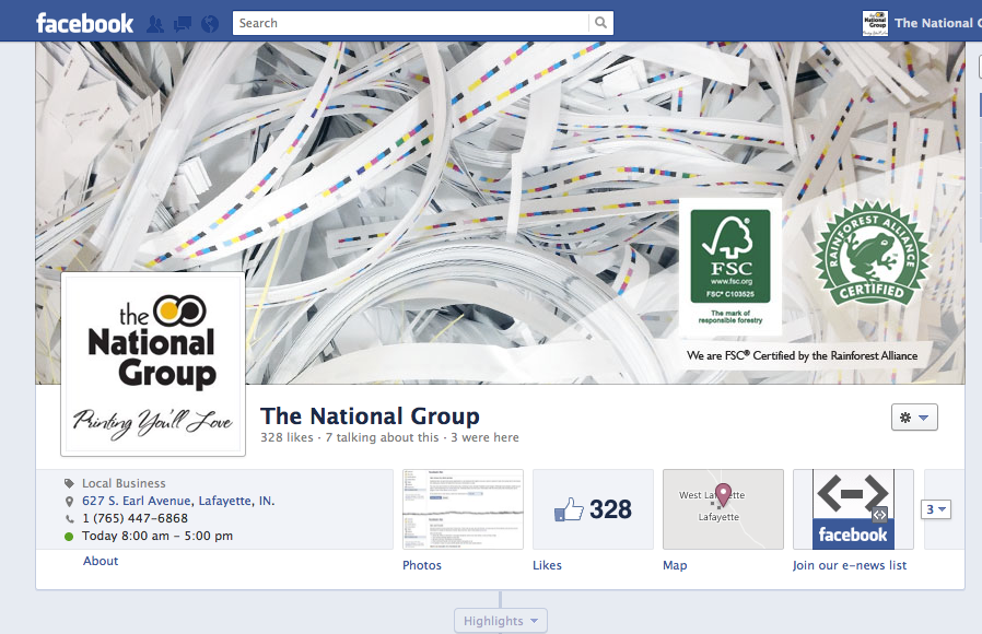
Between the website and social media the brand was also being used inconsistently on apparel and other publicly visible areas. The branding standard guide was created to share information with staff and also outside vendors on the overall look and feel of the company’s identity standards. In conjunction with their employee hand guide, this booklet was created to share the branding standards so that each project is executed with the highest level of craft.

The brand Standard book that contains Logo Standards, Color Options, Acceptable Taglines, Fonts, textures that go with the brand, logo use on embroidered items, etc. The Standard book was primarily an internal guide for employees. A one page guide with logo usage was created for outside venders such as apparel embroidery.

Website and Mobile Site

iMac_iPhone
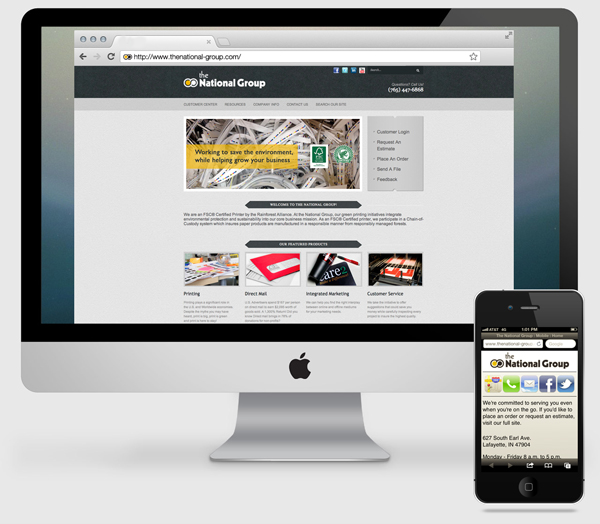
Next we evaluated the current website and the analytics of each page. Looking at click through rates and page hits we were able to establish top content and remove or relocate content that was getting lost. We evaluated the last 90, 60, and 14 days to compare numbers and page visits over time.
Something that was also missing were direct links to the social media pages on the home page and mobile site. This is something simple to add and is a key in creating a consistent cross-platform brand.

The mobile site was really created as a landing page for print clients to access emails and contact information for their print sales representative. In addition they could access hours, location, and social media news.


Social Media Branding
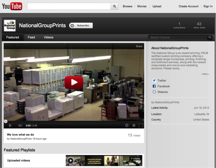
Screen Shot 2012-09-25 at 1.49.35 PMnew_facebook2

YouTube Page

In addition to Facebook and Twitter we updated the YouTube page. With no videography equipment and no budget the video was shot with an iPhone and edited in iMovie.

youtube